
Jackson DeVico
they/them
Human-Computer Interaction Master's student - University of Maryland
B.S. Games and Simulation Arts and Sciences - Rensselaer Polytechnic Institute

Hi there! I'm Jackson...
...or "Azure", as some people call me. My pronouns are they/them.I'm fascinated by all the unique and interesting ways that people interact with systems, media, and each other. My background in games and cognitive science uniquely positions me to empathize with users and curate human-centered experiences. I believe that accessible design benefits all users.I'm experienced with Agile Methodologies, Project Management, UX Design, and User Research.
I also have an extensive background in Programming, Games and Simulation Design, and 3D modeling.I love clouds. So massive, yet so elegant. So many diverse varieties too, all amazing in their own ways.

University of Maryland - INST 711: Visual Design Studio
Updating the Visual Design of "Testudo"

Experimental Media and Performing Arts Center (EMPAC)
Demonstrating waste-water treatment to environmental engineering students through 360 simulation

University of Maryland - INST 710: User Experience Research Methods
A Contextual inquiry of student
engagement and utilization of GenAI summarization tools in an academic context
Demonstrating waste-water treatment to environmental engineering students through 360 simulation
Experimental Media and Performing Arts Center (EMPAC)
January 2024 - April 2025
Overview
This project involved creating a 3D simulation of a waste-water treatment plant for use as a supplement to a field trip of an actual waste-water treatment plant.For the first year of development, I was the sole developer of the project under the advisement of a professor and an EMPAC research engineer. After this year, I recruited a group of students, and my role shifted towards management.
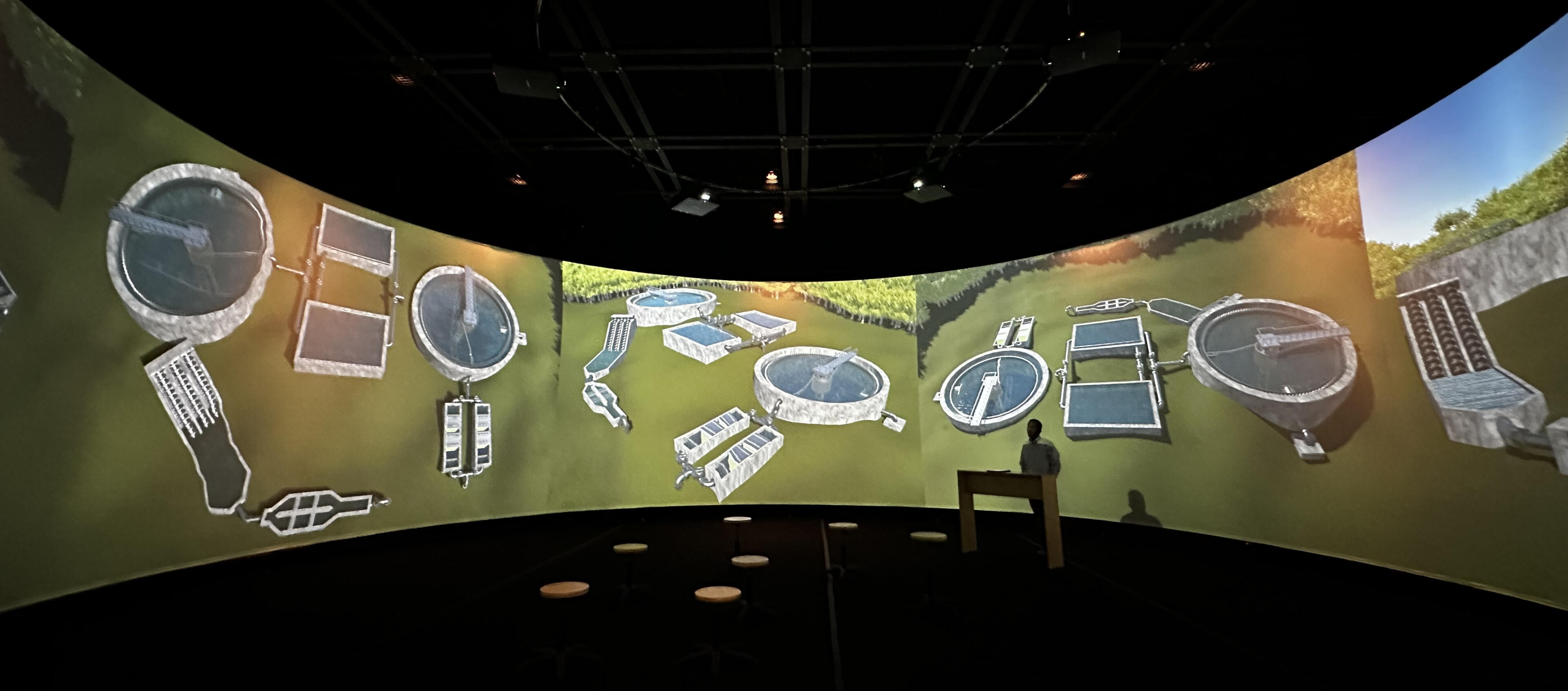
The first demo of the waste-water treatment plant
Problem
The target audience was undergraduate students taking an introductory environmental engineering course. The professor's proposal sought a virtual model of a waste-water treatment plant that would achieve the following:
Visually demonstrate how a waste-water treatment plant functions using 3D models and animation on EMPAC's 360 screen.
Provide information views that are inaccessible during an in-person tour of a real-life waste-water treatment plant.
Be realistic enough to act as a sufficient substitute to an in-person tour of a waste-water treatment plant, if one is not able to occur during the semester.
The initial time between starting development and the first in-class demonstration was four months, after which the future direction of the project would be evaluated. Later on, a (potable) water treatment simulation was also developed, after which a larger team of students was formed to begin a migration to Unreal Engine.
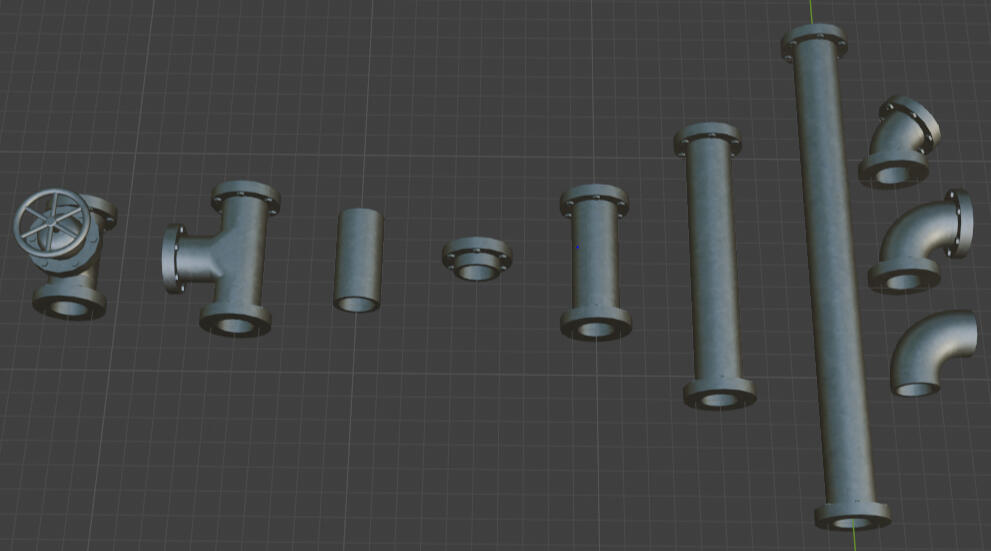
Textured pipe models in Blender
Process
After meeting with the professor to discuss project needs, I met with the EMPAC research engineer to discuss what technology we would move forward with. We decided that Unity Engine and Blender were ideal for modeling and rendering the simulation because work for the 360 screen using Unity Engine already existed, and Blender is a free established software that would allow for easy transitions between personnel in the future.The project went through four development segments:
Development of the waste-water treatment plant simulation
Refinement of the waste-water treatment plant simulation
Development of the water treatment plant simulation
Migration to Unreal Engine
For the first three phases of development, the process involved creating 3D models, texturing the models, integrating the models into Unity Engine, and adding details such as animation, particle effects, physics, and camera setups. Every two weeks I would meet with the professor to receive feedback on how to improve the realism of the models and adapt them to the specific lecture the professor intended to give.

The internal view of an aeration chamber
One issue I encountered was how to properly display tall objects on the 360 screen. While the screen is tall, the much larger circumference results in a very wide aspect ratio, cutting off taller objects (as seen above). To account for this, I created models with walls removed, and added additional camera angles that bring the entire object into view.

The cross-sectional view of an aeration chamber
For the last few months I was involved in the project, I recruited students with more specific specialties to handle the most significant portions of development as we began to migrate the simulation to Unreal Engine. We used Notion to track team progress, and my responsibilities shifted towards managing team efforts, running meetings, providing progress reports, and creating documentation.
Results
By the end of my time on the project, I had developed a functional simulation of both a waste-water treatment plant and a water treatment plant. Features include multiple camera angles (including cross-sections), pipe flow visualization, and physics-based particle movement simulation. Alongside a team, work was also started on an Unreal Engine version of the simulation, which would have more realistic lighting and textures, more detailed models, and audio.After each demonstration, the professor collected feedback from students through direct questions and take-home surveys. The results consistently showed that students felt they had a better understanding of water treatment processes after experiencing an immersive lecture with the simulation.The success of the project also helped jumpstart an initiative from other professors to collaborate with EMPAC to develop similar teaching tools. I worked on two other similar projects for shorter lengths of time, one which combined Google Maps data with drone footage to show rock layers for a geology class, and another which used 3D scans to teach people about how cleanrooms are used.
Updating the Visual Design of "Testudo"
University of Maryland - INST 711: Visual Design Studio
September 2025 - December 2025
Overview
Testudo is the Registrar’s website for the University of Maryland. Students use the website to register for classes, view their schedules, access other sections of UMD’s website, and more. However, the visual design of the site is outdated, broken, or does not support users.In this project we update the visual design of Testudo to improve the usability and visual appeal of the site. We limit our focus to four pages: the home page, schedule of classes, student schedule, and final exams.While involved in most aspects of this project, the aspects in which I was solely responsible for were the heuristic and accessibility evaluation, design library, and Schedule of Classes pages.
Problem
Testudo’s visual design of the site is outdated, broken, or does not support users. Our goal is to update Testudo’s visual design. The timeline for the project is 6 weeks. Our process is as follows:
Identify existing issues through analysis and models
Draw inspiration from outside sources
Create a design library (updated during wireframing)
Low fidelity
Mid fidelity
High fidelity
Final product
Process
Current Design Analysis

Testudo's existing home page
The existing design of Testudo has many issues, including:
Redundant links and excess elements add visual clutter
Images are blurry/don’t display properly
Modals (like Shelly) block interactables
Inconsistency between pages
Some features are not responsive to mobile devices
Graphics are sometimes used in place of text, hindering accessibility
Heuristic Evaluation
A heuristic evaluation of Testudo's pages of interest revealed significant issues. Below is a brief list of the Nielsen Norman heuristics that are relevant to each screen. A detailed written audit can be found here.Home page:
Heuristic 2 (Match Between the System and the Real World)
Heuristic 5 (Error Prevention)
Heuristic 6 (Recognition Rather than Recall)
Heuristic 8 (Aesthetic and Minimalist Design)
Class registration page:
Heuristic 1 (Visibility of System Status)
Schedule of classes/final exams pages
Heuristic 7 (Flexibility and Efficiency of Use)
Heuristic 8 (Aesthetic and Minimalist Design)
Contrast Evaluation

Design Inspiration
Our visual design direction is based on two sources. The first is UMD’s existing visual branding. We chose to utilize Testudo’s shell logo because it is simple, modern, and can fit in many locations. The second is the website for Marathon, a game developed by Bungie.

On top: UMD branding, on bottom: Marathon website
Low Fidelity
Our low-fidelity stage focused on exploring our visual direction and blending visual styles into a cohesive design vision. We explored typography and layout decisions for multiple screens. This screen uses a card layout that we expand upon in mid and high-fidelity.

Mid Fidelity
The mid-fidelity schedule of classes screen expands upon the low-fidelity version by adding relevant information to the cards, and moving more towards the Marathon visual design language. The search options are also condensed to be simpler to scan and interact with. We would continue to use progressive disclosure as a design principle moving forward.

High Fidelity
Moving into high-fidelity, we began bringing our designs together to promote cohesion. We unified our color choices (UMD’s base colors + accent colors for links and schedules) We also altered our grid systems to not use gutters, and instead use thin border strokes to separate sections.

We also introduced a “light mode” concept, and created some alternative screens for light and dark mode in our finishes product.

Design Library
Our design library evolved throughout the design process, but the following is a representation of our core design elements, colors, and typography.

Results
Our final designs blend a modern, minimalist, technological aesthetic with the University of Maryland’s iconic Testudo branding and colors. The new pages emphasize simple information architecture, progressive disclosure, visual elements with meaning, and a unified, consistent design language across all the pages. Moving forward we would expand upon our screens to implement light mode and dark mode for all of them, conduct user research and collect feedback, and iterate based on said feedback.

Schedule of classes, desktop, dark mode

Schedule of classes, desktop, light mode

Schedule of classes, mobile, dark mode

Schedule of classes, mobile, light mode
A Contextual inquiry of student
engagement and utilization of GenAI summarization tools in an academic context
University of Maryland - INST 710: User Experience Research Methods
September 2025 - December 2025
Overview
This summary is non-exhaustive. A detailed report of the entire project can be found hereThis project involved examining student use of a generative AI (genAI) summarization tool as a lens to learn about their specific wants, needs, and expectations of genAI in an academic context.Project responsibilities were divided fairly evenly, with all members involved in processes such as affinity diagramming and interviewing. In addition, I was allocated the role of project manager, and I managed scheduling, organized meeting, and maintained project software (Notion).
Problem
Our research questions were the following:
What shapes student engagement in generative AI (genAI) in an academic context?
How can these insights inform design interventions that meet the specific wants, needs, and expectations of college students?
The timeline for the project was about three months, and consisted of identifying the problem statement and research methods, data collection, analyzing and creating models, and proposing design interventions. The research culminated in an in-class wall walk at the end of the semester.
Process
Contextual Interviews
We utilized a mixed-methods approach to collect specific insights while still reaching a large population. Our primary research method was contextual interviews, and our secondary research method was digital surveys.We conducted five in-person contextual interviews with students from University of Maryland's Human-Computer Interaction Master's program. These interviews were all approximately one hour long, and had three phases:
The user is asked about their existing genAI experience and use patterns in academia.
The user completes a task involving NotebookLM and an academic text they are familiar with, and their behavior and interaction patterns are observed.
The user is asked about their experience completing the task.
Surveys
Surveys were open to the entire University of Maryland student population. Students were recruited mostly through announcements in digital spaces and in-class announcements from professors. The survey had three sections:
Background questions about student demographics and genAI experience.
Likert scale questions about academic genAI use and trust.
Open-ended questions that ask the student to describe how genAI impacts their academic work.
Affinity Diagram
After each data collection, we held interpretation sessions to align our team understanding of the data. Using our findings from these sessions, we created an affinity diagram.

Sensation Board
As a team, we divided to create additional models to supplement the affinity diagram. I worked on the sensation board, which is a model designed to capture the experiences and sensations that an ideal product should manifest. Our sensation board captures four core ideas: optimized flow, in control, confident clarity, and conscientiously engaged.

Design Visioning
Based on our observations and models, we creating design visions that implement our findings. We started with three visions, evaluated those visions, and ultimately conceptualized one cohesive design intervention.Through our final vision “WorkSpace”, we delivered a central, customizable AI learning environment that supports optimal flow, confident clarity, and a strong sense of control through adjustable settings, guided refinement tools, and transparent citation modes.

Results
Our key findings were that:
The wants, needs, and expectations were largely based on their subjective experiences, feelings, and ethics.
Participants often drew on these emotional sensations when discussing their wants, needs, and expectations of generative AI tools in an academic context.
Thus, student participant use of generative AI summarization tools were largely based on embodying certain emotional sensations during engagement.
These sensations include control, efficiency, clarity, and conscientiousness.
During a wall walk, we presented our models, design concepts, and findings, and received feedback from observers. Many people left notes on our affinity diagram expressing that they agreed with certain sentiments from our affinity diagram, especially regarding ethical concerns surrounding AI usage. Many visitors also left notes asking potential follow-up questions to our research.

Our wall walk presentation, starting from the left and moving to the right